Hi All,
I hope you’re having a good weekend.
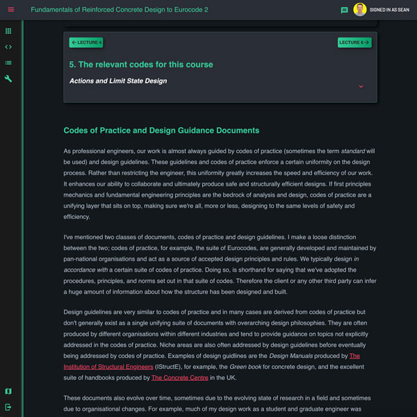
I’ve pushed a small update to Labs to improve the readability of the text lectures there. There was something about the styling of the text that’s been bothered me; I was finding it uncomfortable to read after a while - something to do with the bright white text I think.
So, after much trial and error, I’ve updated the font colour, size and spacing to improve readability, see the screenshot below (of one of the text lectures from the new course)…
This grew into a wider update to the look and feel of site. Likely more tweaks to follow but I really just wanted to flag the readability improvement - especially with the forthcoming concrete course.
There’s also a plan to eventually include my tutorials from the main DegreeTutors site, into Labs so you’ll have one single place to search through all content - I also really don’t like the way equations appear on the main site - Labs provides a much better reading experience (now :).
Anyway - that’s it. Enjoy the rest of your weekend.
Seán
